

"A sneak peek of my work at EdPlus as a UX Designer."
I worked as a UX designer at EdPlus at Arizona State University (ASU) for almost 2 years. EdPlus is an enterprise unit within ASU that focuses on designing and delivering scalable digital teaching and learning models to enhance student success and lower barriers to achievement in higher education.
Our team is responsible for creating and maintaining the Rocket Design System (RDS), a comprehensive design system. Additionally, we design websites for renowned brands such as Adidas, ASU Online, Dreamscape, Starbucks, Uber, and the US Air Force.
Timeline
Feb 2022 - Dec 2023
My Role
UX Designer
Project Team
User Experience team at EdPlus
Overview
-
Collaborated with other designers and developers to create a component library called Rocket Design System (RDS), resulting in a 50% reduction in design production time.
-
Optimized more than 150 existing components, leading to a 30% improvement in component performance.
-
Splitting the main source library into three libraries increased design modularity by 60%.
-
Documented more than 150 components, including both new and old ones, in Zero Height, providing designers with a comprehensive reference guide. This documentation reduced onboarding time by 25% for new team members.

Design System
Components Optimization
What is Rocket Design System?
The EdPlus Rocket Design System is a system of standard design components focused on the design, development, and analytics behind our digital products, including the ASU Brand, SEO, accessibility, UX, speed, usability, and scalability. Rocket Design System promotes cohesiveness across our digital assets to empower the ASU brand. The design system allows units to focus more on the student experience by promoting innovation and spending more time elevating our digital experiences for student success.
Problem
-
The search process for mobile components in XD lacked intuitiveness, resulting in difficulties in locating specific components.
-
With the growing size of the component library, designers faced increased time and effort in finding the necessary components.
-
Designers had to repeatedly add content and images in the mobile state for each landing page design.
Solution
-
To address the search issue, the solution involved merging desktop and mobile components and streamlining the component search process.
-
The introduction of States in Adobe XD provided a valuable feature for optimizing and consolidating components.
-
By leveraging States, the design team successfully optimized the components, simplifying their discovery and usage in both desktop and mobile design projects.
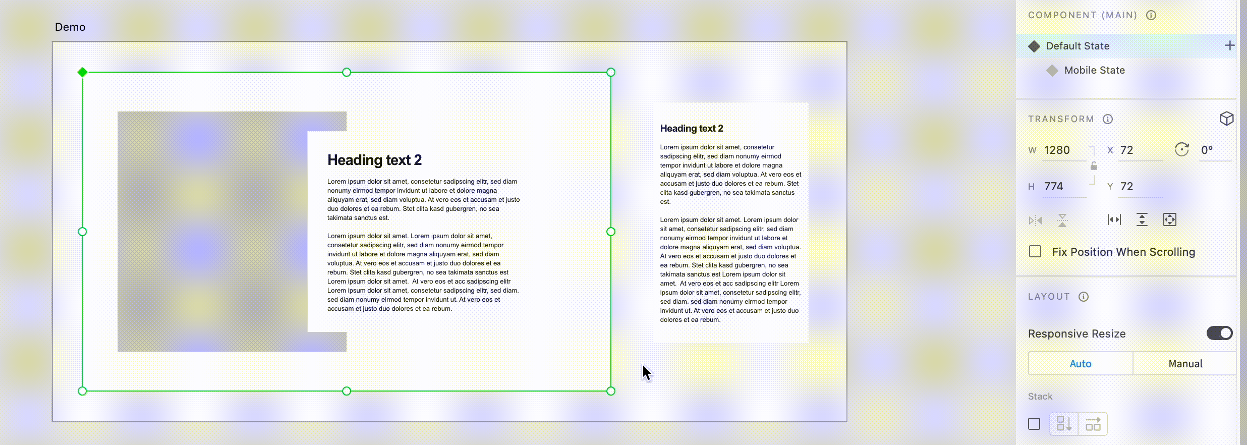
RDS Component optimization
Through component optimization, we have significantly improved the efficiency of designing for multiple devices. Our approach ensures that designers no longer need to make specific content changes for mobile states. With our optimized components, any modifications made to the content, image placement, or spacing in the desktop state seamlessly reflect in the mobile state, eliminating the need for manual adjustments.
This streamlined process not only saves time and effort but also guarantees consistent design across different devices, empowering designers to focus on their creativity and deliver high-quality user experiences.
RDS Component optimization
Design System
Components Creation
Problem
-
The lack of organization and structure in the existing component library posed challenges for designers, as all components were stored together without clear categorization or proper structure. This made it difficult to locate specific components efficiently and slowed down the design process.
-
The limited number of components available in the library imposed restrictions on design options and hindered the creative flexibility of designers. This limitation forced designers to either reuse the same components repeatedly or spend additional time creating custom components from scratch, impacting productivity and design quality.
Solution
-
To address the organizational issue, the component library was divided into three distinct libraries: Foundations, Base Components, and Section Components.
-
This reorganization significantly improved the overall structure and made component discovery easier for designers.
-
Furthermore, several new components were created and added to the library, expanding the available design options and providing designers with greater flexibility in their designs.
"The reorganization and expansion of the component library empowered designers with enhanced organization, increased design options, and improved creative flexibility"
EdPlus’s RDS (Rocket Design System) contains foundations, base components, and section components.
-
Foundations: The foundations (also known as design tokens, atoms, etc.) are native to the system. The foundations dictate the ASU brand and they cannot be changed.
-
Base components: These are the smallest entity components that are already functional and cannot be broken down any further. These components are already functional UI pieces that can be put anywhere on the page.
-
Section components: Sections are areas or rows of a website, and every website can be seen as a list of sections. When you analyze sections of a website, you can think of them as a combination of design and functionality together that are contributing to a page on a website.


Base Components

Section Components
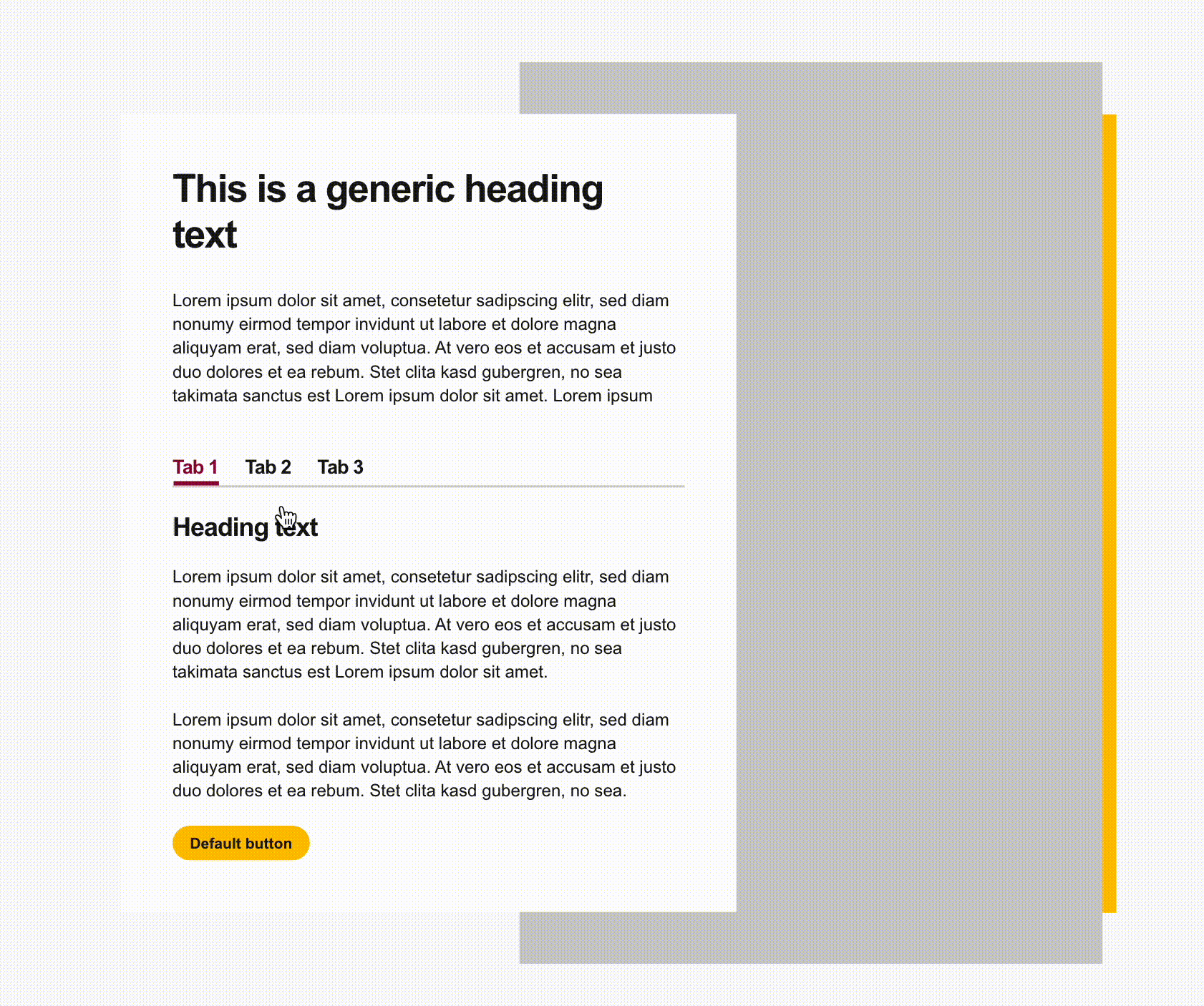
We have successfully designed and developed a range of essential RDS components, including the intro section, fields, RFI, parallax section, pagination, tabbed panel, header, footer, explore section, card components, sticky nav, and more.
Furthermore, to ensure comprehensive coverage, we have created all possible variations of each component. As exemplified in the image below, the card components showcase an array of options available for website implementation. This meticulous approach guarantees that designers have access to a versatile set of components to cater to various design requirements and enhance visual diversity across our projects.

Different types of card components
Designing landing page using RDS components
All of the ASU Online pages are created using RDS components. ASU Online, a renowned online education provider, relies exclusively on RDS components to build its entire website. With an extensive range of online programs spanning diverse subjects such as business, engineering, digital media, sustainability, and more, ASU Online offers students a vast array of degree and certificate options.
As an integral part of the design process, I utilized RDS components to create a dynamic and visually captivating ASU Online page. By leveraging the versatility and consistency of the Rocket Design System, I ensured that the page not only effectively showcases the multitude of programs available but also delivers an immersive user experience.


The responsive design of ASU Online page
What did I learn?
-
Proficiency in Agile Project Management: Acquired proficiency in utilizing Jira and working within an agile development environment, enabling efficient project management and streamlined workflows.
-
Leadership and Effective Communication: Demonstrated leadership by providing guidance, instruction, and fostering effective communication to facilitate partnerships with other designers.
-
Cross-Functional Collaboration: Successfully collaborated with designers, developers, content writers, researchers, and product managers, contributing to cross-functional project success.
-
Design Quality Assurance (QA): Conducted design quality assurance (QA) of the website, ensuring visual consistency, adherence to design guidelines, and an exceptional user interface.
-
End-to-End Component Management: Gained experience in the end-to-end process of introducing components to developers, performing design QA, and maintaining a master source design library, facilitating smooth developer-design handoffs and preserving design integrity throughout the project.
Next steps
-
Right now Rocket Design System is totally designed in Adobe XD. So next phase of the Rocket Design System is to design components in Figma.
-
Adding more base and section-level components in the design system.