

Project Team
2 UX Designers
1 Developer
1 Product Manager
1 Business Analyst
Project Duration
June 2022 - Dec 2022
Tools
Adobe XD
Photoshop
Key Responsibilities
UX Research, UX Design, Ideation, Prototyping, Micro-interaction,
Design System
Overview
-
Implementation of the AirU Design System resulted in a 25% decrease in design turnaround time, enabling more efficient design iterations and faster delivery of design assets.
-
Redesigned academic standing modal improved student comprehension by 25% and reduced information overload by 40%, resulting in a visually appealing and user-friendly design.
-
Redesigned the program status component with a three-dial interface resulted in a 50% reduction in time spent on course management, allowing students to focus more on learning and coursework.
-
AU Student Portal experienced a 30% increase in user participation after design enhancements, fostering greater student engagement.

Design System
Air University Design System
What is Air University?
Air University is a professional military education university system of the United States Air Force. It is accredited by the Commission on Colleges of the Southern Association of Colleges and Schools to award master's degrees. Air University partnered with ASU to transform distance learning for Air Force officers and civilians worldwide. This is the first time a U.S. military service utilized a civilian university partner to enable the delivery of officer PME.
Problem
-
Due to the absence of established design guidelines and standards, there was inconsistency in the use of design elements, such as colors, typography, and layouts, across different projects within Air University.
-
There was no centralized repository or clear guidelines for designers and developers to access and utilize components effectively.
-
As a result, designers often had to recreate components from scratch for each project, leading to duplicated efforts, wasted time, and inconsistencies in the final designs.
Solution
-
Identify existing design inconsistencies and areas for improvement in the design system components.
-
Optimize and create new components based on design requirements and best practices.
-
Publish the AirU library to centralize and document the components for easy access and reuse.
-
Develop program-specific components to streamline design updates for individual courses.
AirU Design System
As part of the project, I played a key role in creating and optimizing various components for Air University. These components were then published in the AirU library, ensuring easy access and utilization for other designers and developers.
In addition, I developed program-specific components and components for the AirU onboarding tour. This allowed designers to quickly make updates and changes to specific courses by selecting and applying the relevant components from the library. Overall, these efforts streamlined the design process and improved efficiency for the entire team. Listed below are some of the important components that I created and optimized for Air University.

Course cards
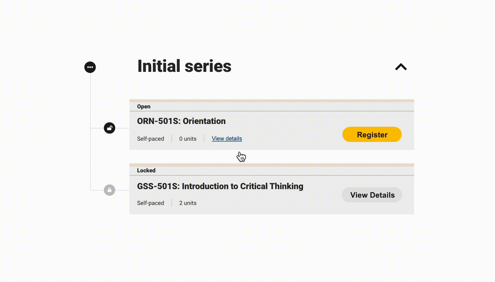
Course details accordion
I developed a versatile component with multiple states to effectively display the status of students on the Air University portal. This component showcases various statuses such as enrollment, suspension, on hold, and more, providing clear visibility into each student's current status.
In addition to the student status component, I also created and optimized a range of other components for the Air University portal. These components included course details accordions, progress dials, program-specific components, and onboarding tour components. The aim was to ensure a cohesive and visually appealing design system that enhanced the user experience throughout the portal.

Air university portal using newly created components
User experience enhancement
Academic standing modal redesign
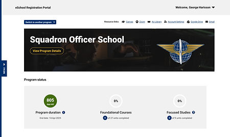
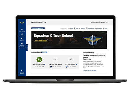
Air University Student Portal
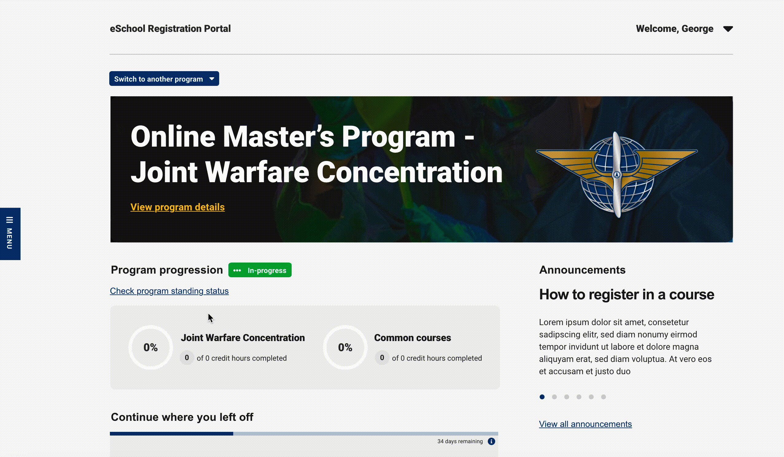
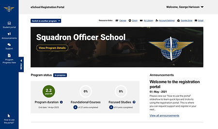
The Air University Portal serves as a central hub for Air University students, providing them with an efficient and user-friendly platform for course management and access to essential resources. Through the portal, students can enroll in courses, track their progress, and access course materials, ensuring a seamless learning experience. The portal's intuitive interface and streamlined features enable students to easily navigate through their academic journey, empowering them to focus on their coursework and make informed decisions about their educational path.
Problem
-
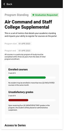
The existing design of the academic standing modal was outdated and presented an overload of content, making it difficult for students to understand and interpret their grades, GPA, and course withdrawals.
-
The lack of visual representation and excessive textual information resulted in a cumbersome user experience, where students were unlikely to read and comprehend the details provided in the tooltip.
Solution
-
Develop Multiple Design Concepts:
-
Create a range of design concepts that offer various options for visualizing student progress and academic standing.
-
Explore different approaches to present the information in an intuitive and user-friendly manner, ensuring easy comprehension for students.
-
-
Consider Visual Elements:
-
Explore the use of visual elements such as progress dials, bars, and typography to improve the visual representation of information.
-
Gain insights into successful techniques and strategies to inform the design process and enhance visual communication within the academic standing modal.
-
Old Design
The old design of the academic standing modal is outdated and overwhelms students with excessive content. It is evident that students are unlikely to read the tooltip due to the information overload it presents.
Therefore, it is imperative to visually represent the text, enabling students to quickly comprehend the information without relying solely on tooltips. By adopting a visually intuitive approach, students can easily digest the content, improving their overall understanding and engagement with the academic standing modal.


Old Design
Ideation
Design concepts for academic standing modal
-
To find the best ways to visually represent tooltip information and overall student progress, I created seven different modals with various options utilizing progress dials and bars.
-
Each modal presented unique design approaches to effectively visualize the information. This exploration allowed us to identify diverse visual representations that enhance the understanding of student progress and create an improved user experience.

Visualize student progress with vertical progress dials

Visualize student progress by showing more information

Simplified visualization for clear academic standing

Enhanced visual hierarchy for improved readability
Visualize student progress with progress bars

Progree bar indicators for easy progress identification

Streamlined layout for concise academic information
Final Design
Following valuable feedback from stakeholders, the final design was selected. To enhance user readability and draw attention to important details, the numbers within the modal were displayed with larger font sizes. This careful consideration aimed to ensure that students can easily notice and comprehend the information when accessing the modal interface.

Streamlined layout for concise academic information
Key factors in choosing the final design
-
Clarity and Simplicity: The final design was chosen for its ability to present information in a clear and straightforward manner, eliminating unnecessary complexity and making it easier for students to understand their academic standing.
-
Consistent Visual Language: The selected design maintained consistency with the overall visual language of the Air University platform, ensuring a seamless transition for students and reinforcing the brand identity.
-
Accessibility Considerations: The final design took into account accessibility principles, such as adequate color contrast and legibility, to ensure that students with diverse needs can easily access and interpret the information presented in the modal.
User experience enhancement
Program status component redesign
Problem
-
Addition of Third Dial:
-
Stakeholders require the inclusion of a third dial in the program status component to represent program duration accurately.
-
However, there is uncertainty regarding how to display the duration in terms of days, months, or years.
-
-
Handling Graduation Status:
-
It is unclear how to handle the display of program duration when a student is graduating or has already graduated.
-
The component needs to accommodate different stages of a student's academic journey effectively.
-
-
Space Limitations:
-
Incorporating a third dial poses a challenge as the existing design was initially intended for two dials.
-
Finding a solution to add the third dial without overcrowding or compromising the overall layout is crucial.
-
Solution
-
Iterative Design Iterations:
-
Develop multiple design iterations that showcase different ways of visually representing program duration in days, months, and years.
-
This approach allows for exploration and testing to determine the most effective and intuitive representation.
-
-
Graduation Status Indication:
-
Incorporate a graduation date or year indicator for students who are graduating or have already graduated.
-
This feature helps clearly communicate their program completion status and adjusts the program duration display accordingly.
-
-
Expandable or Collapsible Menu:
-
Create a design solution where the menu or dial section can expand or collapse as needed.
-
This feature allows for efficient space utilization and provides a streamlined interface when the third dial is not in focus, ensuring a clean and uncluttered design.
-
Ideation
Design concepts for program status component
-
Multiple design concepts were explored for the program duration display, including options for showing duration in days, months, and years.
-
A collapsed menu design addressed space limitations, while additional concepts catered specifically to graduating or graduated students.
-
These diverse design approaches ensured effective communication of program duration and accommodated various student scenarios.

A program duration dial showcasing the remaining days until program completion

A program duration single dial indicating the remaining months in the program completion
A program duration dial representing the remaining years in the program completion
A program status component design while menu is collapsed

A program status component design when the program is completed

Highlighting graduation status by including the graduation date, and omitting the program duration dial for enhanced clarity
Final Design
The final design choice features program duration displayed in years and includes graduation date indicators for graduating and graduated students. This decision enhances clarity, usability, and visual appeal in the program status component. The streamlined design ensures a seamless user experience, allowing students to easily track their progress and stay informed about their academic journey.
A program duration dial showcasing the remaining years until program completion

A program status component design highlighting the graduation date
Key factors in choosing the final design
For the program duration displayed in years
-
Ease of Understanding: Displaying program duration in years was chosen as it provides a simplified and easily accessible representation. Compared to days or months, using years eliminates the need for lengthy and potentially complex numerical values, ensuring a clean and visually pleasing design.
-
Consistency with Academic Standards: Representing program duration in years aligns with standard academic practices, making it familiar and easily understandable for students.
For the graduation status indicators:
-
User-Friendly Interface: The selected design for graduation status indicators ensures a user-friendly interface, allowing students to easily identify their graduation status at a glance without any confusion or complexity.
Impact
-
Improved Student Engagement: The redesigned program status component, along with other design enhancements in the Air University Portal, led to a 30% increase in active user participation, fostering greater student engagement in their educational journey.
-
Streamlined Course Management: The implementation of the program status component with the three-dial interface resulted in a 50% reduction in the time students spent on course management tasks. This streamlined approach allowed students to focus more on learning and coursework completion.
-
Enhanced Comprehension: The redesigned academic standing modal achieved a 25% improvement in student comprehension, enabling them to understand their grades and academic progress more easily. The simplified and visually appealing design reduced information overload by 40%, allowing students to grasp important information more effectively.
-
Accelerated Design Process: The implementation of the AirU Design System resulted in a 25% decrease in design turnaround time. The optimized components and published design library facilitated more efficient design iterations and faster delivery of design assets.
What did I learn?
-
Cross-functional Collaboration: Learned the importance of engaging in cross-functional conversations to understand the project's scope and complexities. Collaborating with diverse team members provided valuable insights and early feedback, allowing for faster progress and effective problem-solving.
-
Agility and Adaptation: Discovered the value of being open to feedback and adapting quickly. Embracing an agile mindset enabled me to make prompt adjustments and improvements, leading to better design outcomes.
-
Effective Communication: Clear and consistent communication with stakeholders and team members played a crucial role in project success. Regular communication ensured alignment, minimized misunderstandings, and kept the project on track.
-
User Empathy: Developed a deeper understanding of the importance of empathizing with users. Taking the time to put myself in their shoes helped me design solutions that better met their needs and provided a more enjoyable user experience.
Future Consideration
-
As mobile usage continues to grow, consider optimizing the design system and the Air University Portal for mobile devices. Ensure a seamless and intuitive experience across various screen sizes and platforms to accommodate the mobile needs of the Air University students.
-
Pay attention to accessibility standards and guidelines to ensure that the design is inclusive and accessible to all users, including those with disabilities.