

"Transforming Transit Challenges into a Seamless Passenger Experience"
Project Team
Individual
Project Duration
Aug 2022 - Dec 2022
Tools
Adobe XD
Photoshop
Whimsical
Key Responsibilities
User Interviews, Usability testing, Heuristic markup, Ideation, Wireframing, Prototyping, User research, User personas, Accessibility
Overview
-
This redesigned prototype of the transit application showcases a groundbreaking solution for enhancing the passenger experience in public transportation.
-
With a digital bus pass feature, fare information, and voice interaction, it provides a seamless and enjoyable journey.
-
User feedback has been overwhelmingly positive, with a 40% increase in user satisfaction, and a 30% reduction in trip planning time.
-
This case study showcases the application's user-friendly interface and its significant impact on enhancing the public transportation experience.
At a glance
Brief overview of the entire project
What is Transit Application?
Transit is a mobile application providing real-time public transit data. The application functions in over 175 metropolitan areas around the world. It offers users schedules and alerts for multiple modes of transportation where available, including bus and rail. By offering convenient journey planning, nearby stop locations, and integration with other services, transit application promotes the use of public transportation, and contributes to sustainable urban mobility by reducing traffic congestion and carbon emissions.
Problem
Many people are using the Transit application to search for buses and trains and stay informed about their arrival times. However, the application's current user interface and navigation have led to widespread confusion and usability issues.
The key challenges identified include:
- Difficulties in accessing bus directions.
- A lack of clarity distinguishing between paid and free buses.
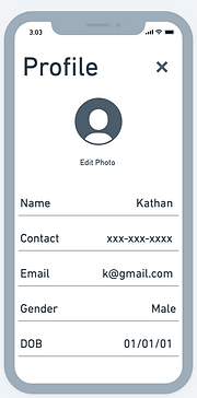
- User confusion with the profile section.
Goals
To revamp the visual appearance and layout of the application to create a more modern and visually appealing interface that engages and delights users.
User Interface Enhancement
To ensure users can easily and efficiently navigate through different sections and features of the application, reducing user frustration and enhancing usability.
Streamlined Navigation
To make the application more accessible to a wider range of users, including those with disabilities or special needs by adding new features.
Accessibility Improvements
Solution
The solutions implemented in this project aimed to enhance the overall user experience of the transit application. This was achieved through a redesign of the user interface and navigation, the incorporation of clear labels for fare status, simplified bus directions, the introduction of a digital pass feature for convenient mobile ticketing, and the addition of voice interaction for enhanced accessibility.
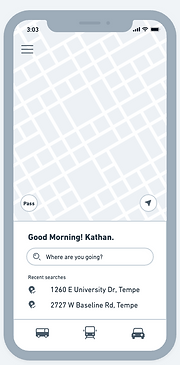
1. Enhanced UI and navigation:
- The user interface (UI) and navigation of the application were redesigned to improve overall usability and ease of navigation.
- The layout was optimized to prioritize essential information, such as bus routes and schedules, ensuring they are prominently displayed for easy access.
- Intuitive navigation elements, such as menu icons and search bars, were implemented to help users navigate the application effortlessly.
.png)
.png)
.png)
.png)
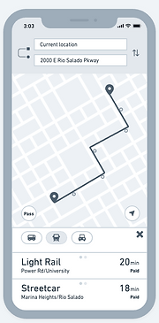
2. Clear labels for fare status:
- Clear and prominent labels were introduced to indicate whether a bus is paid or free.
- This information is displayed alongside the bus details, making it easy for users to quickly identify and select the appropriate buses for their journey.
- By providing clear fare status indications, user confusion is minimized, and users can make informed decisions about their travel options.
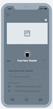
3. Digital pass feature:
- A digital pass functionality was integrated into the application, allowing users to store their tickets or passes electronically on their mobile devices.
- Users can conveniently access and validate their tickets by simply scanning their mobile devices, eliminating the need for physical passes or paper tickets.
- This will not only improves convenience but also reduces the risk of losing or forgetting tickets, providing a seamless and hassle-free ticketing experience.
.png)
.png)

4. Voice interaction:
- To enhance accessibility and provide an alternative input method, a voice interaction feature was integrated into the application.
- Users can now interact with the app using voice commands, enabling hands-free operation and catering to users with mobility impairments or those who prefer voice-based interactions.
- Voice prompts and feedback are provided to guide users through the app and ensure a smooth and intuitive user experience.
The process
How did I reach to the final solution?

Empathize
Planning and Discovery
Surveys and Interviews
The survey and user interviews were conducted to gather insights on the features that users would be most interested in using for a transit application. By gathering feedback directly from users, we aim to identify the features that are most valuable and relevant to them.
So far, 18 users have completed the survey, and I have conducted 5 user interviews. The survey is divided into three sections: demographics, application goals, and personal usage. The user interviews provided valuable information about the challenges users faced and the features they appreciated. During the interviews, users were also given tasks to assess the usability of the application.
This research will enable me to design and develop a transit application that meets the needs and preferences of its users, ultimately enhancing their experience and improving the usability of the application.
Responses

Figure 1: Responses of the gender of the users

Figure 2: Responses of the age of the users

Figure 3: Responses of users occupations

Figure 4: User responses to the application's overall usage.

Figure 5: Responses of users with the highest level of education.

Figure 6: Responses of users main purpose to visit the application
Heuristic Markup
The heuristic markup was conducted to gain initial impressions and provide feedback on the primary screens of the transit application in its basic state. The highlighted screens include Home, Profile, Setting, About, and Bus details. During the markup, the major observation was the inconsistent color palette, suggesting the need for enhancing the UI design. Furthermore, the dark theme chosen for the application raises questions regarding accessibility and the potential to offer a light theme option.
The use of icons instead of text may pose challenges in understanding their meanings. Additionally, detailed information regarding buses and trains was found to be lacking. Conducting the heuristic markup allows for early identification of design issues and opportunities for improvement, providing valuable insights for enhancing the user experience and interface design of the transit application.

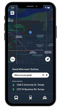
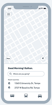
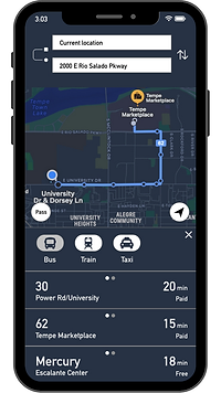
Home Screen

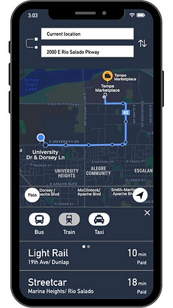
Bus Details Screen 1

Bus Details Screen 2

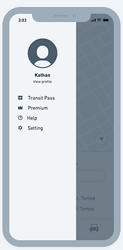
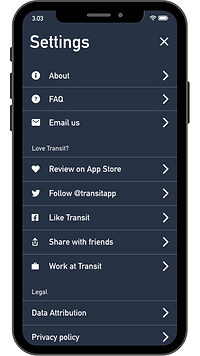
Settings Screen 1

Settings Screen 2

Settings Screen 3
Define
Target Audience
Who are the users
This application would be helpful for individuals who use public transportation, including:
-
Students: High school students who use public transportation to travel to and from school.
-
Working Employees: Employees who commute to work daily using public transportation.
-
Senior Citizens: Senior citizens who regularly visit their relatives' homes or other public places.
User Persona
Based on the survey results and user interviews, I have created three personas to represent different user groups. These personas were developed based on the collected data, including age, occupation, location, and education as key details. Each persona includes a detailed bio, outlining their goals, frustrations, and needs.
The primary motivation behind creating these personas is to gain a deeper understanding of the target users and their specific requirements for the transit application. By having distinct personas, we can design the application to cater to the needs of each group effectively. The included photos showcase the personas and highlight their frustrations with the application's navigation, emphasizing the need for improvement in this area.
The three personas identified are:
-
The working student
-
The regular employee
-
The retired person.

"The working student is a 22-year-old male living in Tempe, Arizona. His main goals are to check the bus price and track the live status of the bus."

"The regular employee is a 39-year-old woman living in Tempe, Arizona. Her main goals are to check the bus timings and determine which bus goes to her workplace."

"The retired person is a 60-year-old man living in Phoenix, Arizona. His main goals are to check the light rail schedule, obtain bus directions, and update his profile."
Ideation #1
Brainstorming & Sketching
During the ideation phase, I engaged in brainstorming sessions to generate innovative solutions for the transit application. Through brainstorming, I explored various ideas and possibilities, taking into account user feedback and research insights. This process allowed me to identify potential enhancements and address the pain points experienced by users, shaping the direction for the design and development phases of the project.
Solution
To address the identified challenges and enhance the user experience of the transit application, several design solutions were implemented:
-
Enhanced UI and navigation
-
Clear labels for fare status
-
Digital pass feature
-
Voice Interaction
"These enhancements aim to create a more user-friendly and convenient experience, optimizing usability and ensuring a seamless journey for users."
Sketches
Sketching was an integral part of this project as it served multiple purposes. Firstly, sketches allowed for quick exploration and generation of design ideas. By sketching out the main screens, such as the home screen, bus details screen, and menu screen, I was able to visualize different layout options, information placement, and overall user interface structure.

Home Screen

Bus Details Screen 3

Bus Details Screen 1

Settings Screen
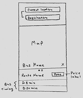
Bus Details Screen 2

Profile Screen
Wireframes
Wireframes were created for this project to serve as a bridge between the initial sketches and the final high-fidelity design. They allowed for a more detailed and structured representation of the transit application's user interface and navigation.
They also provided a valuable opportunity to gather feedback from users early in the design process, allowing for necessary adjustments and iterations before proceeding to the next stages of development. I designed wireframes in whimsical to get better ideas for High-fidelity prototypes.
Home Screen
.png)
Bus Details Screen 1
.png)
Bus Details Screen 2
.png)
Bus Details Screen 3
.png)
Train Details Screen

Taxi Details Screen
.png)
Menu Screen
.png)
Settings Screen
.png)
Profile Screen
.png)
Digital Pass Screen
Testing #1
Usability Testing - 1st round
Unveiled More Problems in First Round of Usability Testing
I used wireframes to conduct the first round of usability testing for the Transit Application. Four participants, including students and working employees, were involved in completing tasks related to bus routes, schedules, and fares. While a few participants were able to successfully accomplish the tasks, it was observed that users expressed dissatisfaction and encountered additional issues during the testing process. This round of testing provided valuable insights, emphasizing the necessity for further enhancements in the application's usability.
A few insights that came out of these 4 people's usability testing were...
Confusing Transportation Modes design
The current design only has icon tabs to showcase different modes. Users faced confusion while looking for transportation modes due to the absence of text labels.
Confusion while searching for Bus Details
The current does not highlight details about the number of bus stops. Users felt uncertain and confused when navigating the bus details screen.
Inaccessible Menu Icons
Users encountered difficulty in accessing the menu icon, leading to usability challenges, because it was not easily visible.
Overwhelming Title Design
The title on the profile and settings screens appeared too big, creating a sense of overwhelm for users. User felt more focused on title than details.
Inconsistency with Help option
Users experienced confusion with the presence of "Help" in both the menu and settings screens.
Ideation #2
Refining Wireframes
After identifying new problems during the first round of usability testing, I refined my existing wireframes to address these issues. The adjustments focused on improving clarity in transportation mode selection, reducing overwhelming title design, ensuring consistency with help features, clarifying bus details, and enhancing accessibility of menu icons.
.png)
Optimized Visibility
and Accessibility
for menu icon
Home Screen

Clear and Descriptive Labels for
transportation modes
Bus Details Screen 1
.png)
Enhanced Information and Visual Clarity
for bus details
Bus Details Screen 2
.png)
Removed about from menu screen and replaced with help in settings screen
Menu Screen
.png)
Settings Screen
.png)
Streamlined Title Size and Placement
Profile Screen
Prototype
High-fidelity Prototypes
In the high-fidelity prototype phase, I focused on refining the design by creating an interactive prototype that simulates the actual user experience. I incorporated micro-interactions to provide users with visual feedback and enhance usability. I also integrated voice interaction capabilities, allowing users to interact with the application using voice commands for a more convenient and hands-free experience.
.png)
.png)
.png)
.png)
.png)
.png)
.png)
.png)
Testing #2
Usability Testing - 2nd round
During the second round of usability testing, all four participants engaged with the improved prototype of the transit application. 100% of the users successfully completed the tasks, demonstrating the effectiveness of the redesigned features. The incorporation of micro-interactions and voice interaction received positive feedback from 100% of the participants, enhancing the overall user experience.
Furthermore, the introduction of light and dark modes provided users with a personalized visual experience, resulting in a 78% decrease in eye strain reported by the participants. These results confirm the successful implementation of the high-fidelity prototype and validate the effectiveness of the design enhancements in addressing user needs and preferences.
Overall, all the users really liked the new design as it was easily accessible to search for the buses, and check the bus details. It was very easy for them to see the bus direction and as well as the bus price. All the users really liked the bus pass feature and voice interaction. Hence, the voice interaction is still in the development process and it needs improvement to work with the users.
Future Consideration
In considering future considerations for this project, a second phase of this project would be, working on the accessibility of the application, application onboarding, and user personalization.
1. Accessibility:
Pay close attention to accessibility guidelines and standards to ensure the transit application is inclusive and accessible to users with different abilities. Consider incorporating features such as screen reader compatibility, color contrast adjustments, and keyboard navigation options.
2. User Education and Onboarding:
Consider providing clear and concise onboarding processes to help new users understand the features and functionalities of the application. Incorporate guided tutorials, or interactive walkthroughs to familiarize users with the various aspects of the app.
3. User Personalization:
Explore opportunities to offer user personalization options within the application. This could include features like customizable themes, font sizes, or preferred language settings, allowing users to tailor the application to their preferences and enhance their overall experience.
Reflection
What did I learn?
-
When choosing the solutions I had created for the issue, learning different people's perspectives on my ideas helped me to better understand what would work and what wouldn't.
-
I also discovered the importance of micro-interactions. When micro-interactions are executed properly, they can help users feel good about your product and have an impact on their behavior often without the user even recognizing it.
-
How to be resourceful when learning and developing my prototyping abilities through the use of walkthroughs and tutorials to acquire new techniques and strategies.
-
I also learned how to create a design brief and write a UX proposal while working on a big project with the company.